Custom Date Picker: Customize Financial Charts via Google Finance
OVERVIEW
Advanced investors frequently requested the ability to update a stock chart to a custom date range. My task was to create an experience that allowed investors to quickly and intuitively update charts to their desired date range.
My Role

Leading UX Researcher and UX Designer
Team

My manager and Product Designer at Google

Product Manager
Timeline

June 2022 - Jan 2023
UX Writer
Tools


UX Research Consultant
Engineer
UX Design Consultant
Figma
PROBLEM STATEMENT
How might we create an experience where users can find the right dates? How might we improve Google Finance time intervals?
GOAL
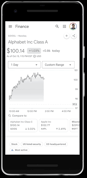
Design an experience that allows Google Finance users to set a custom date range for a performance chart.
CONSTRAINTS
This was a mobile-first design. I worked within an existing design system and material design, ensuring all the colors were accessibility standards.
DESIGN PROCESS

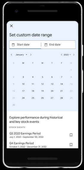
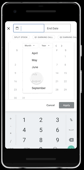
CALENDAR FLOW
.png)
.png)
.png)
.png)
EVENTS FLOW
.png)
.png)
.png)
TARGET USERS
High income
Strategic Investor
Tends to do in dept stock research
Most likely male
Research Conducted
DATA ANALYSIS
Why do users want a custom date picker?
Requests for a custom date picker were made from February 2021 - July 2022
58
“Hello there, just my feedback again on the chart tool: it would be much more valuable if instead of the fixed windows (on 1y 5y and max) could be adjusted for custom date! It shouldn't be difficult and would be very very helpful! Tks!”
User from Brazil
What time intervals do users want to see on Google Finance?
3M
User wants a 3M option to analyze how a stock price has changed within a financial quarter.
2Y
3Y
Users want a 2Y and a 3Y time interval because the period between one and 5 years is too wide, users want to be able to look at long-term performance of relatively new stocks. They also want to make meaningful comparisons.
Date Purchased
From my user interviews, I determined that users were interested in the date that they purchased the stock, so I added a date purchased section.
CURRENT


PROPOSED


When do users use a custom date picker?
Personalized Dates
An existing investor would like to search the stock performance on the date he/she purchased the stock
1
Historical Events
An existing investor is curious
how the stock performed during specific times
2
Compare investments
Compare two or more investments using custom date ranges
3
COMPETITIVE ANALYSIS
7
Financial websites
Yahoo Finance
MarketWatch
SimplyWallSt
Finviz
CNBC
5
Financial apps
Yahoo Finance
Cash App
Public
Robinhood
Webull
3
Beacons
Google Flights
Kayak
Travelocity
Good user experiences for custom date pickers have
-
different ways of inputting a date Ex: a calendar input, a date input or a slider
-
reinforces the selected dates
-
several competitors included more time intervals
USER FLOW SKETCHES
I used my background research to come up with three concepts in order to find the most intuitive solution for a custom date picker.

LOW FIDELITY PROTOTYPE
Concept 1
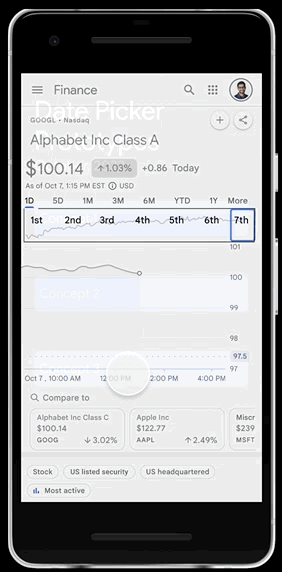
Concept 2
Concept 3
USABILITY TEST
I conducted a usability test with 5 Googler and found these insights:
-
Users preferred seeing the calendar, more familiar with UI treatment.
-
Users want to be able to input a specific custom range that’s easy to get to and simple, instead of complex sliding interactions that might be fun but take time to get used to.
-
Users liked being guided/helped throughout the process to make things quicker and smoother. [Event chips, autopopulate]
-
Suggestion: Align final designs with concept 1 (More drop down). Create a design where users have the fewest clicks possible to enter a date. Include more options for specific events like COVID and housing crisis in the suggested chips.
DESIGN EXPLORATIONS
What Didn't Work
I wanted to figure which design would be the most easy to understand so I explored different variations. These are examples of designs I considered for the events flow.


These are examples of colors that I explored for the hi-fidelity version of the design. I chose blue because it aligns with the google design system and it met accessibility standards.
.png)


Hifidelity Prototype
What did I learn?
I learned the importance of asking follow-up questions during a UXR study to ensure that you are actively listening to participants instead of reading a script. I learned how to use the Google design system to create high-fidelity mocks. Furthermore, I solidified some basics in UX design such as how interactions work. I practiced some problem-solving skills; being restorative is my strength, and each step of the way I had to figure out how to create a better experience for the user.